Have you ever heard the saying, “if you don’t ask you don’t get”?
I am assuming most of you will have. I can remember my father telling me this after I watched him negotiate a discount on a new car when I was a young boy. I use it now when a client or potential client asks for something and at the same time apologies about the request.
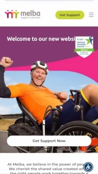
How does this relate to websites you may ask. Ever filled out a form or called a phone number promoted on a website? Good chance you have but with some it may of taken a while for you to find the place on the website that the form was located or the number was available. If you would like customers and potential new customers to interact with you then ASK THEM TO because if you don’t ask you don’t get.
Is your business friendly enough for customers to call you on the phone? Do you find that if you can get to talk to a prospective customer, the majority of the time you can win them over? If your answers are yes then your phone number should be BIG and BOLD up in the top right hand corner of your website. This tells website visitors you are friendly enough to talk to on the phone and will make them more likely to call.
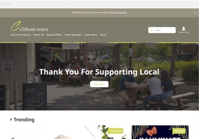
Do you like to capture some potential customer information then follow up in some form afterwards? If this works for you then provide an offer on your home page that requires the website visitor to hand over a little information say their name and email address in return for maybe a voucher to use when they order or if you have a retail store when they come in. This approach can help get the website visitor to interact with your business and can be the difference when they have checked out 3 different providers online but you were the only one to ASK them to engage.
Call us today on 1300 884 865 to get a customer focused web design quote or click here to fill out a form.


