A tale as old as time,
true as it can be,
many say the bottom line
is the world of web design
can be tricky…
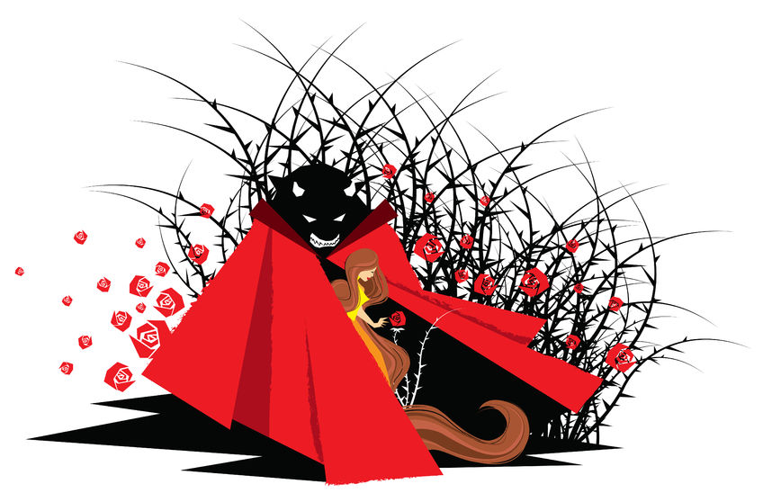
With the live action Beauty and the Beast premiering next year, we at BSO Digital thought this was the perfect time to talk about the Beauties and Beasts of web design. Not-so-clever lyrics aside, the world of web design is a difficult one to navigate, even for seasoned designers. There is a fine line to tread before your website becomes a Beauty or a Beast – and in the fickle digital world, neither of these are going to be successful websites.
The Beauty
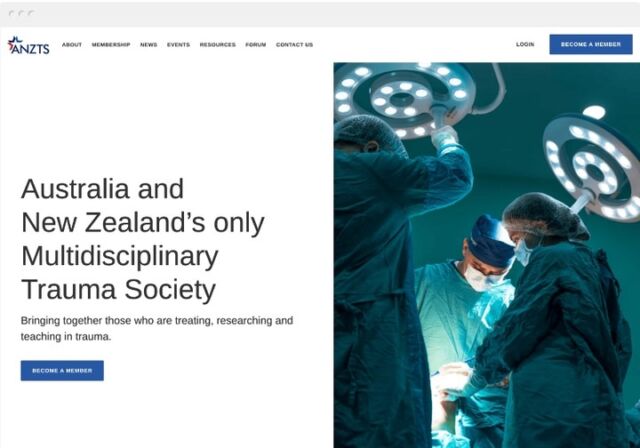
The Beauty is your classic, award-winning website. These websites are modern works of art, as carefully crafted as the Mona Lisa or Michael Angelo’s David. Their designers and developers push the boundaries of “what a website is”, trying to reinvent the way the user approaches and interacts with a website.
Constructed from stunning photography, the Beauty is thought-provoking art and clever use of video. She stops us in our tracks, makes us look and admire – because we love beautiful things. You can see this in the real world through art, models, advertising (think about the hours a food artist put in to make that Big Mac look appetising) and airbrushing. As human beings, we want to have an emotional response to something and the Beauty does just that.
Websites are works of art, don’t get me wrong. Hours and hours of careful thought go into the design and development of a site. But the art of websites is different. Where art itself exists to provoke thought, reaction and debate, websites (like books and music) have an underlying commercial element that cannot be ignored. How often have you picked up a book that was “clever” for the sake of being clever and left you confused as to the point and plot? What about experimental music styles that leave you scratching your head? (yes, we’re looking at you Yoko).
This is what the Beauty is to web design.
In the digital world, you can’t rely on a pretty face to hold the attention of your audience, potential customers or conversions. If there’s no substance – or it’s difficult to navigate to where this substance is hiding, you’re going to lose a lot of users. And every user navigating away from your page, confused or frustrated, is another user who either won’t recommend your site to their social media network – or who will actively encourage people to avoid you!
The ugly side to the Beauty is that she often is a very unsuccessful website. SEO (search engine optimisation) is sacrificed for looks, which means that it is difficult – or impossible – for Google to index the site. Without indexing, it is very possible that people will never find your site at all. The Beauty can also suffer from the incongruously named “Mystery Meat Navigation”. By trying to “push the envelope”, navigation can become downright impossible to actually, well, navigate. Have you ever opened a website and been completely flummoxed as to how you find anything? You find yourself clicking at the page in the vain hope that you’ll get where you want to be – and eventually you navigate away and never return. That’s Mystery Meat Navigation and while it can look clever or pretty, it fails because simply isn’t user friendly or functional.
It doesn’t matter how much money and how many awards your throw at the Beauty. If you sacrifice SEO, functionality, navigation and the original commercial pursuit of the site, your site and business are simply going to fail.
The Beast
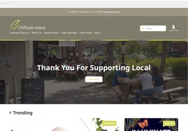
The Beast, by contrast, is perfectly search engine optimised. He ranks highly and gets a good amount of traffic. The Beast is easy to navigate, gets the point across and you will always find what you need. In fact, you’re probably going to click on another article, at the very least, because it is so easy to read.
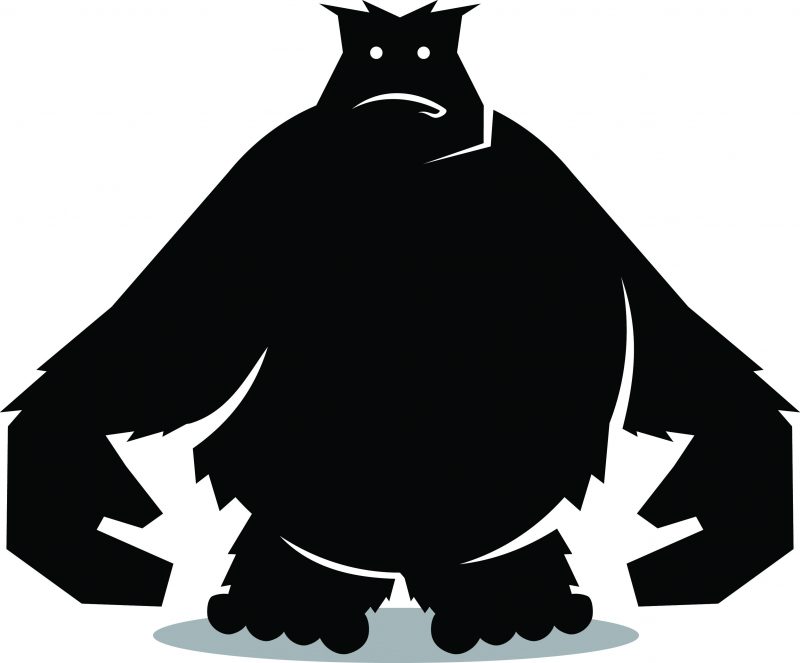
But at the end of the day, the Beast is dull.
After tearing into the Beauty for looking too pretty, it might sound a bit hypocritical for saying the Beast isn’t pretty enough. However, just like a pretty face can’t hold attention for long, the same is said about bare bones design.
Users, especially those browsing eCommerce sites, do look at web design when deciding if an online store seems trustworthy. The Beast that doesn’t utilise design at all can actually seem untrustworthy and drive away potential customers. Using premade designs can also make the Beast seem unappealing, especially when it gives the user the sense that they’ve seen it all before.
There’s nothing about the Beast, other than his raw data, that is very interesting. Users might click another article out of interest but few will go further than that. Simply put, it isn’t fun or enjoyable to spend much time with the Beast. You go to him to get your information and then you leave.
Think about news websites, Wikipedia, or sites for educational institutes (go visit the website for your old school or university – they’re functional (most of the time) but not exactly pretty). You go to these sites for the information you need, and you leave. Just like the Beauty, the Beast can struggle to maintain visitors, even though the SEO is perfect.
So what’s the answer?
Well, just like in Beauty and the Beast, the answer is a marriage between the two very different styles of website design. A site with perfect SEO doesn’t have to be ugly, but you always need to keep in mind that design is only one part of the larger website puzzle.
Users and potential customers have short attention spans. Look at how many tabs you have open right now – you’ve probably got at least a couple going, bouncing between videos, music, some spur-of-the-moment online shopping and this article. So it is important to create something that holds that attention.
It is tricky to strike that perfect balance between well-chosen visual content, written content and optimisation. But it can be done! It simply takes a little more thought and practice to hit that sweet spot. When designing the perfect site, you should consider the following:
- What is the core intent of the site? Is it an online store? A charity? A portfolio? How will the design clearly convey this to the user?
- What is the target audience? How will they find the site? Can they find the site?
- Are users engaged? Is the balance of content keeping them on the site longer? Do users find the site enjoyable/easy to use?
- Is the site functional? Does the user have a clear journey? Will people be able to quickly and clearly find where they want to go? Is your call to action clear?
Remember that a search engine tries to mimic the user experience. It is smart about evaluating the entire site from design to data to development. But it also focuses on what the intent of your website is, and how search engine friendly it is. If you’re all Beauty and no Beast, then search engines are going to struggle to find you.
At the end of the day, we need to put our egos aside when it comes to web design. Rather than focusing on making the Internet a prettier place, create with all facets in mind – utility and design. If you sacrifice one for the other, then your website is not going to have its Disney ending.
Want to find out more about BSO Digital’s web design services? Just click here! We can start making something awesome, together, today!
